Cyber Moon: Fictional Tech Startup Prototype
A sleek, celestial-themed web experience for a fictional tech brand
Overview: The Challenge
Modern tech startups require a digital presence that is not only high-performance but also visually captivating and brand-focused. The challenge was to create a prototype that combined a futuristic, celestial-inspired aesthetic with a scalable, component-based architecture, smooth animations, and a flawless user experience in both light and dark modes.
Live Demo | GitHub Repo | View the Figma Design
🎯 Key Features & Tech Stack
As the sole developer and designer, I built this prototype using a modern, performance-oriented tech stack to bring the celestial-themed brand to life.
- Dark/Light Mode: A smooth, theme-aware toggle using
next-themesthat persists the user’s choice, providing a comfortable viewing experience in any lighting condition. - Modular Architecture: Built with reusable React components for every section, ensuring the codebase is clean, scalable, and easy to maintain.
- Animated UI: Implemented elegant scroll-based fade and slide effects with the AOS library to enhance user engagement and guide them through the content.
- Performance Optimized: Leveraged Next.js for server-side rendering and fast page loads, deployed globally via Vercel.
🖼️ The Live Product in Action
Here are some key features of the final deployed website, showcasing how specific design and development choices create a better user experience.
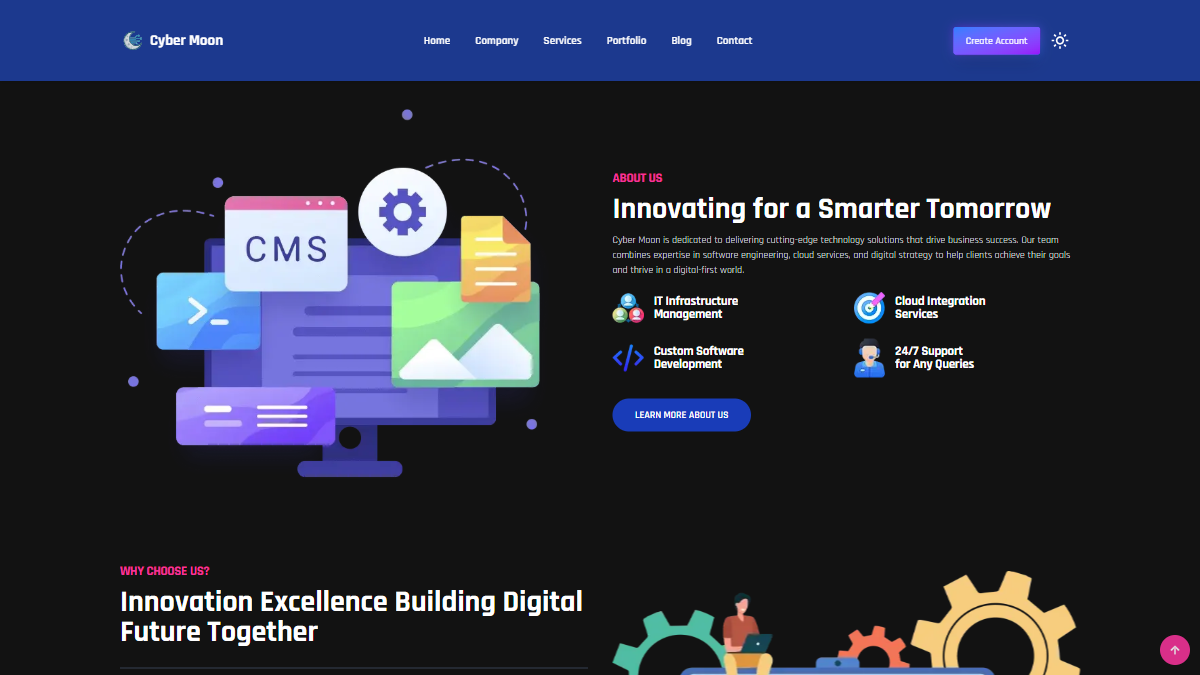
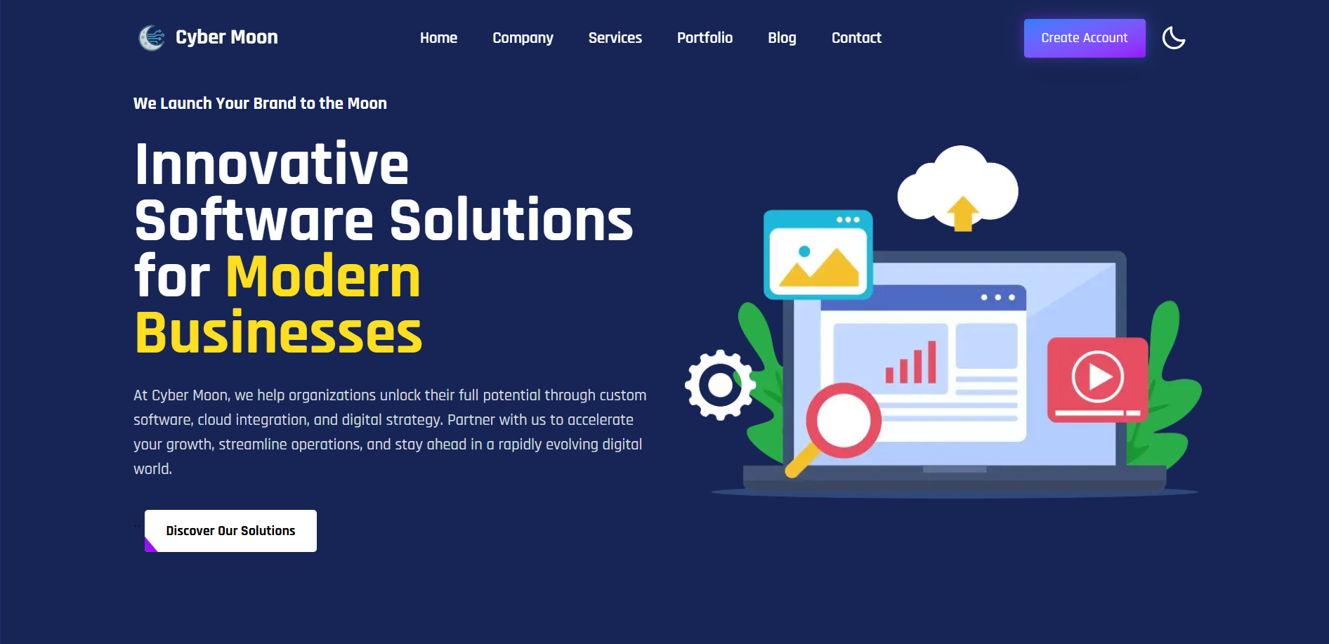
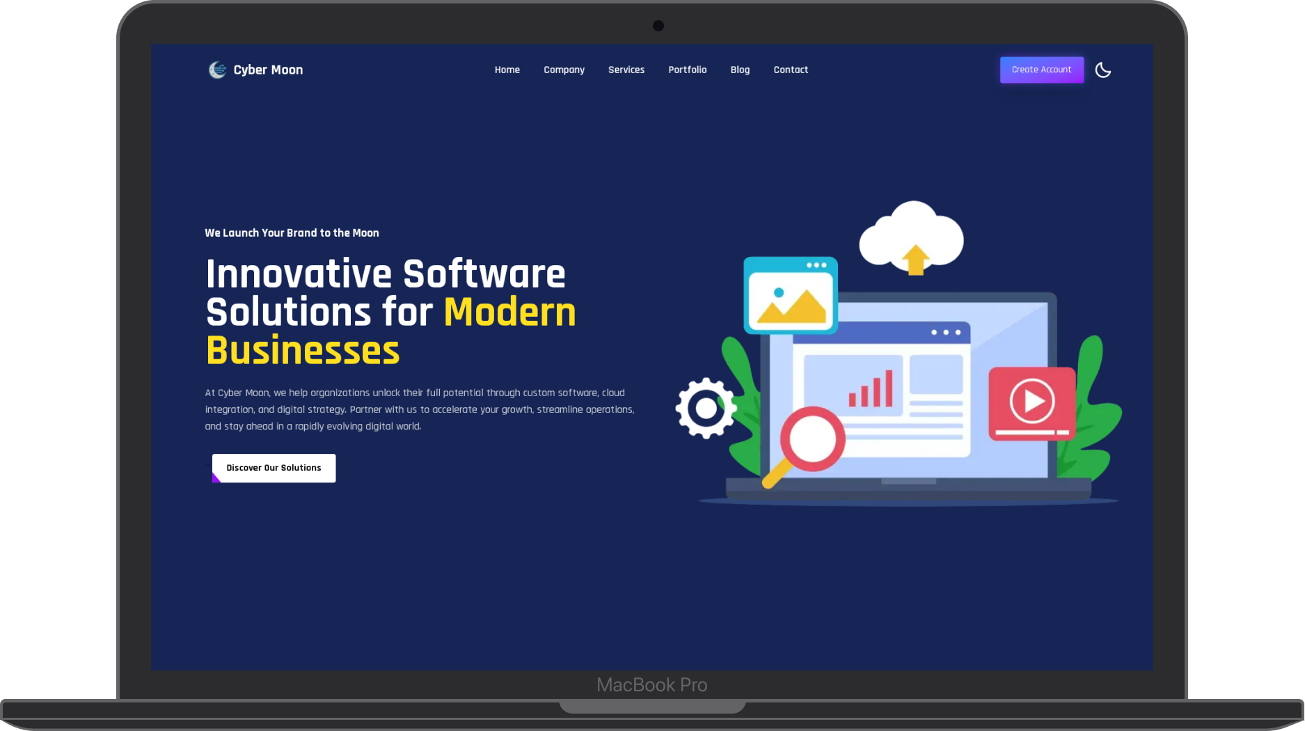
Elegant Dark & Light Modes
The theme toggle is a core feature, providing a seamless transition between a professional light mode and an immersive, celestial-inspired dark mode. The user’s preference is saved for future visits.
Engaging Scroll Animations
As the user scrolls, elements and sections animate into view. This subtle motion, powered by the AOS library, guides the user’s focus and makes the Browse experience more dynamic and engaging.
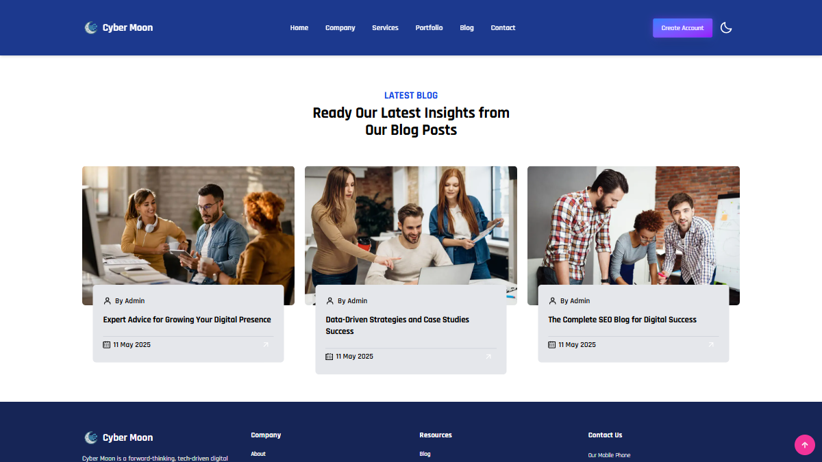
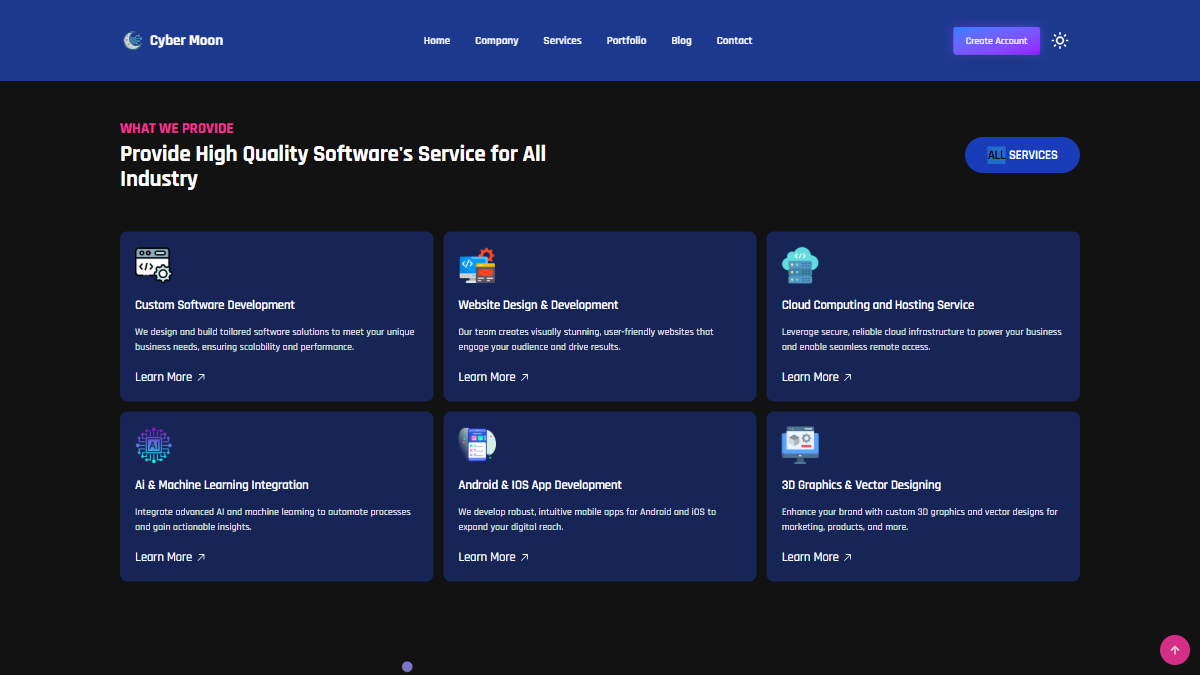
Clean, Modular Card Design
The blog and services sections use a clean, reusable card component. This modular approach ensures visual consistency and makes it easy to add new content without breaking the layout.
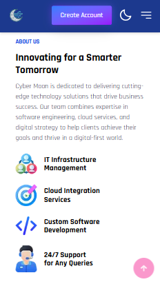
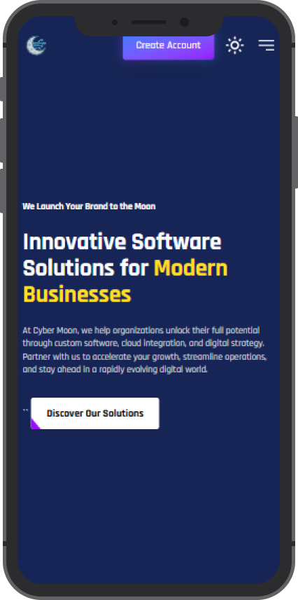
Fully Responsive Mobile UI
The site is fully responsive. On mobile, the navigation collapses into a sleek slide-out menu, and all sections reflow perfectly to fit the screen, ensuring a flawless user experience on any device.
🎨 Design & UI/UX Process
The design goal was to create a futuristic yet professional brand aesthetic that felt both innovative and trustworthy.
- Audience: Targeted tech-savvy clients, startups, and potential investors.
- Color Palette: A celestial-inspired palette using deep blues, soft grays, and gold accents to evoke a sense of sophistication and wonder.
- Typography: Used Rajdhani for headings for its futuristic, technical feel, and a clean sans-serif for body text for optimal readability.
UI Mockups
| Desktop UI | Mobile UI |
|---|---|
 |  |