OllieBites: Fast Food Chain Website Prototype
A vibrant, performance-optimized web experience designed to make customers hungry.
Overview: The Challenge
Fast-food brands need to capture attention instantly and provide a seamless online experience, from Browse the menu to finding the nearest location. The challenge was to design and build a website prototype from scratch that was not only visually appetizing but also fast, responsive, and easy to navigate.
Live Demo | GitHub Repo | View the Figma Design
🎯 Key Features & Tech Stack
As the sole developer and designer, I managed the entire project lifecycle, focusing on a robust and modern tech stack to deliver a high-quality user experience.
- Interactive Maps: Integrated Leaflet.js to display restaurant locations on a dynamic map, making it easy for users to find their nearest OllieBites.
- Fully Responsive UI: Built with a mobile-first approach using Reactstrap, ensuring a flawless and visually appealing layout across all devices.
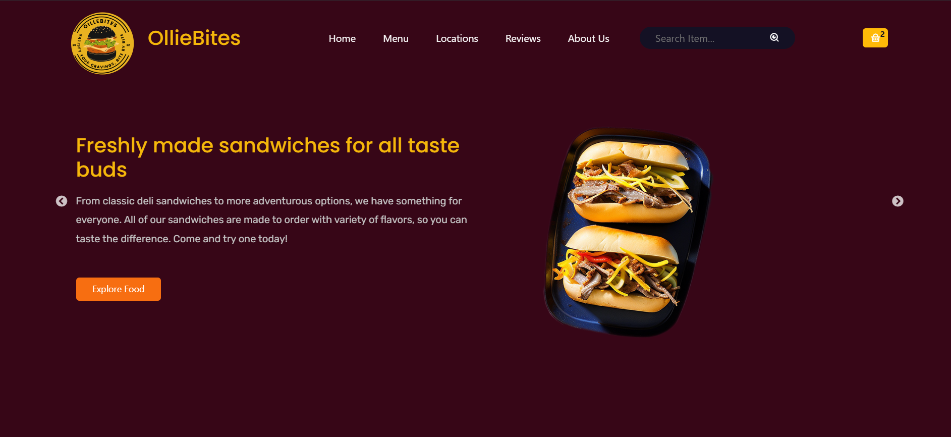
- Engaging Hero Slider: The homepage features a dynamic hero slider to immediately capture user attention with promotional content and delicious food imagery.
- Complete Brand & UI/UX Design: Responsible for the entire visual identity, from the custom logo and color palette to the final high-fidelity mockups in Figma.
🖼️ The Live Product in Action
Here are some key features of the final deployed website, showcasing how specific design and development choices create a better user experience.
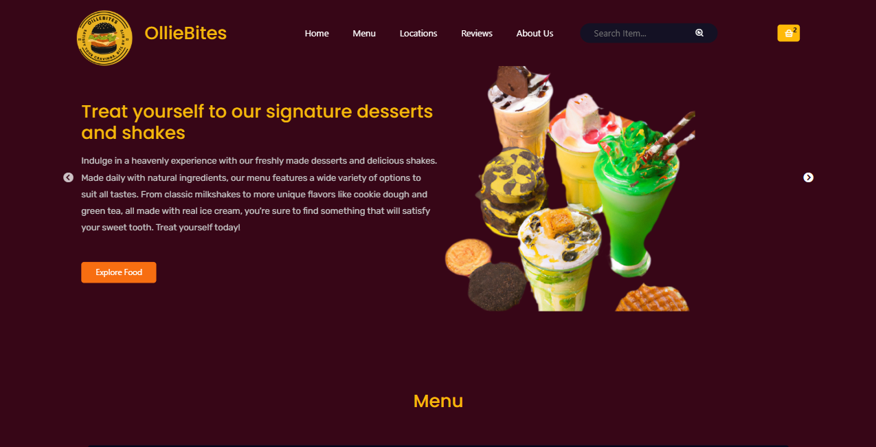
Dynamic Hero Slider
The homepage immediately grabs user attention with a full-width hero slider, using vibrant imagery to showcase promotions and create an appetizing first impression.
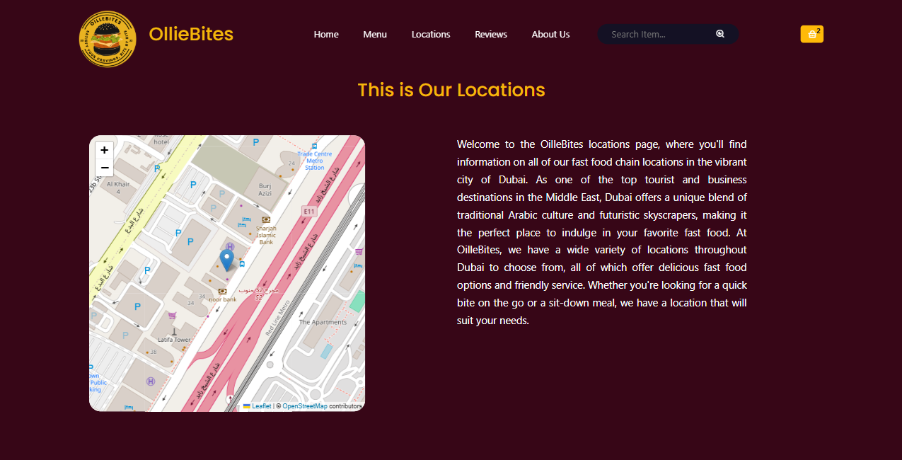
Find Us in a Tap
An interactive map, powered by Leaflet.js, allows users to easily find restaurant locations. This is a crucial feature for a fast-food chain, bridging the gap between the digital and physical experience.
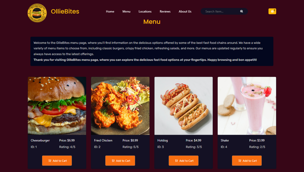
Clear & Appetizing Menu
The “Our Menu” section uses a clean, card-based layout. Each card features a high-quality image, clear pricing, and a concise description, making it easy and enjoyable for customers to browse and decide on their order.
🎨 Design & UI/UX Process
The design process was focused on creating a brand that felt fun, modern, and trustworthy.
- Audience: Targeted general fast-food customers who value speed, visual appeal, and ease of use.
- Color Palette: A vibrant and appetizing palette with Red (
#FF3B3F) and Yellow (#FFD600) to stimulate excitement and hunger. - Typography: Used Poppins for headings to give a friendly and bold look, and Roboto for body text for its excellent readability.
UI Mockups
| Desktop UI | Mobile UI |
|---|---|
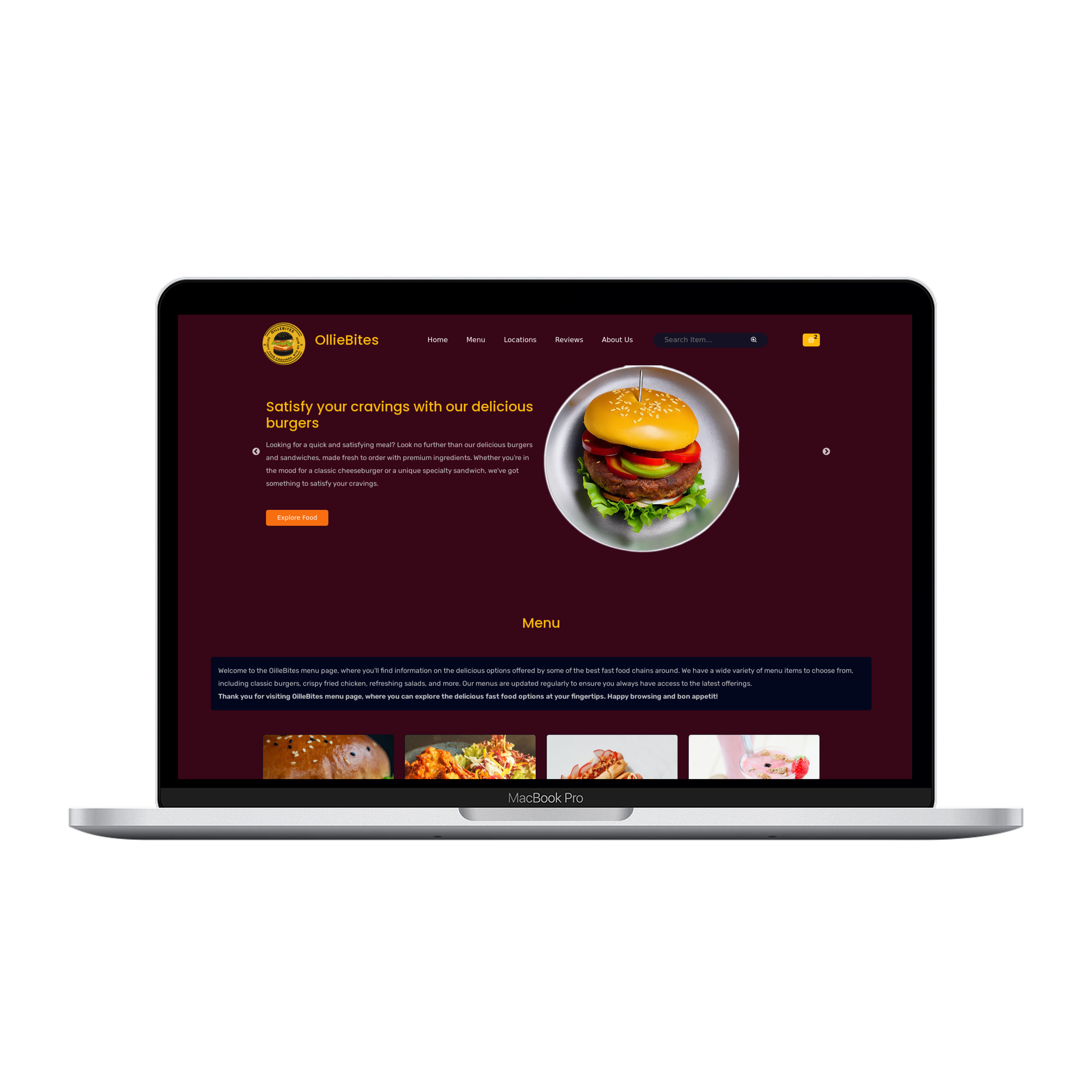 | 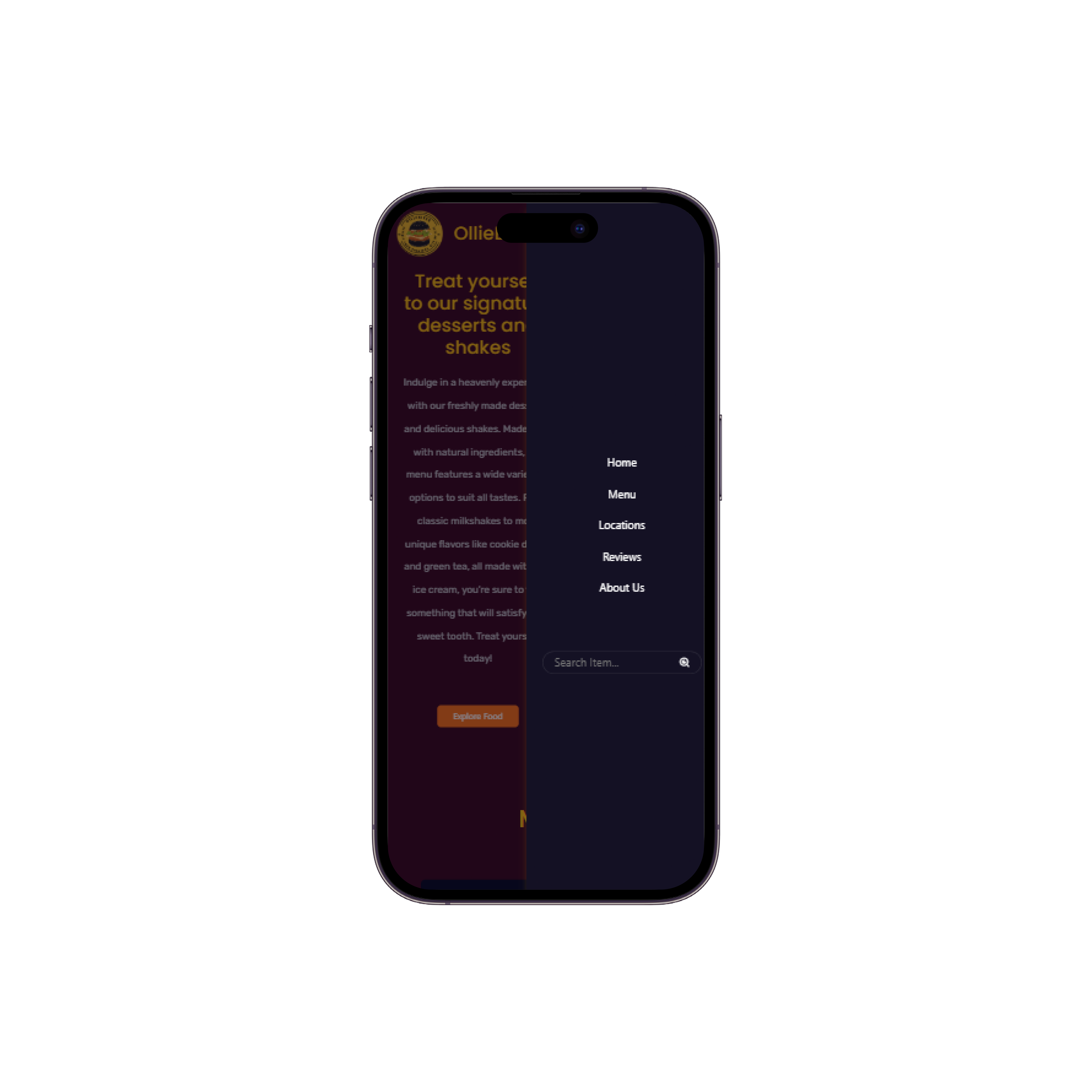 |